I'll bite.
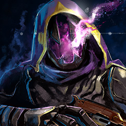
I do like your shader choice. It's a strong contrasting colour set that looks clean, it's pretty hard to find a good shader that doesn't make odd patches on your armour different colours. Kinda like wearing blue jeans with a black shirt.
The main issue I can say, though, is that I can't see any real direction or theme to your armour choices. It feels like each piece of armour was chosen because they look cool, but without a real cause for them to be there.
A simple theme will help direct your choices to make a more cohesive look. The theory can also be applied to your weapons as well, like with my hunter which is themed around a hawk.
(jic you ask, I deliberately didn't choose hawkmoon because I can't find a clean white sidearm (teacup tempest has blue and orange on it), the red also makes a nice accent to break up the monotony of all white)
Overall: 6-7/10. Stands out but doesn't necessarily knows what it wants to be.
this is fair. you're right on how i chose my armor, i won't lie. totally picked everything because i think it looks cool. but the armor pieces don't really match, other than the fact that they all take the shader well.
i could go for a "tougher" look (i.e. my spikey as$ gauntlets) and get some heavier looking boots and chest pieces.
or i could do a more "tactical" theme, focusing on armor with random little bullets or pouches strapped here and there.
i'll do some playing around. my main problem is finding a good cape for this shader. it's an eternal struggle.
Your role as a moderator enables you immediately ban this user from messaging (bypassing the report queue) if you select a punishment.
7 Day Ban
7 Day Ban
30 Day Ban
Permanent Ban
This site uses cookies to provide you with the best possible user experience. By clicking 'Accept', you agree to the policies documented at Cookie Policy and Privacy Policy.
Accept
This site uses cookies to provide you with the best possible user experience. By continuing to use this site, you agree to the policies documented at Cookie Policy and Privacy Policy.
close
Our policies have recently changed. By clicking 'Accept', you agree to the updated policies documented at Cookie Policy and Privacy Policy.
Accept
Our policies have recently changed. By continuing to use this site, you agree to the updated policies documented at Cookie Policy and Privacy Policy.