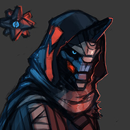
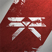
I find [url=http://media1.gameinformer.com/filestorage/CommunityServer.Components.SiteFiles/imagefeed/featured/activision2013/destiny/38670/cov_249_front_610.jpg]this[/url] image (Newest cover of game informer) to look much more interesting than [url=http://www.gametrailers.com/side-mission/files/2013/09/DestinyBoxArt640.jpg]this[/url] one, and imo opinion it would look much better as the box art. It looks more interesting and overall it just looks better. Agreed?
I honestly preferred the original cover.
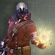
Although I wouldn't mind [url=http://i1263.photobucket.com/albums/ii624/Rj27000/destinycover.png]this[/url] either....
the new game informer one kinda has a resemblance to the reach cover
halo
http://upload.wikimedia.org/wikipedia/en/5/5c/Halo-_Reach_box_art.png
destiny
http://media1.gameinformer.com/filestorage/CommunityServer.Components.SiteFiles/imagefeed/featured/activision2013/destiny/38670/cov_249_front_610.jpg
The original box art was the best IMO, but we may be seeing a trend towards disappointingly generic box covers - take Bioshock infinite for example, Irrational choose a generic image of Booker as the stereotypical GRITTY MILITARY MAN as the box art over other, far more detailed covers to the outrage of the Bioshock community. When Ken Levine was pressed on the issue, he stated that the purpose of the generic cover was to appeal to casual gamers, expecting that original bioshock fans would buy the game regardless of box art. We may be seeing the same thing here.
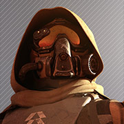
Bungie has to appeal to the crowd that has never heard of Destiny before - and the original box art featuring the traveller - awesome as it is, is hardly going to cut the mustard.
While I like appealing , gorgeous , and visually exciting box art as much as the next guy , but in the grand scheme of things I could careless what the box art is as long as I get to play it....
Your role as a moderator enables you immediately ban this user from messaging (bypassing the report queue) if you select a punishment.
7 Day Ban
7 Day Ban
30 Day Ban
Permanent Ban
This site uses cookies to provide you with the best possible user experience. By clicking 'Accept', you agree to the policies documented at Cookie Policy and Privacy Policy.
Accept
This site uses cookies to provide you with the best possible user experience. By continuing to use this site, you agree to the policies documented at Cookie Policy and Privacy Policy.
close
Our policies have recently changed. By clicking 'Accept', you agree to the updated policies documented at Cookie Policy and Privacy Policy.
Accept
Our policies have recently changed. By continuing to use this site, you agree to the updated policies documented at Cookie Policy and Privacy Policy.